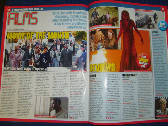
As I am unfamiliar with magazine review pages I am going to de-construct an existing example.
This is the double page review section of the 'Flipside' magazine. It reviews several different films using the same format for each.
Title - who made it - release date
What's the story?
What's it like?
Any clever bits?
Flipside says
By doing this it keeps things uniform so if a reader only wants to read one section of the review they can find it more easily.
As with movie posters the magazine has a set of house colours, red, yellow, blue and white. All of these colours are bold and make the titles etc. more eye catching. To help this, the article has been written in one or two sans-serif fronts. This means it is again more uniform making it more easily understandable.
The language used in the writing is quite complex in some ways. The writer use phrases like 'bum-numbingly exhaustive' to describe the films which highlights the almost sarcastic tone the reviews hold as well.
Since it features more than one review, there is a limit of one or two pictures per film. This enables them to fit more on the page with the two biggest picture accompanying the reviews for the films they have done previous features on in the magazine.
Finally, they add additional information in circular bubbles around the page which makes them stand out.
From this deconstruction I deduce that the conventions of magazine review pages are:
- Review more than one film and keep the structure uniform.
- Have a set of three or four house colours
- Use a sans-serif font because it is easier to read
- Use quite complex language in the article
- Limit the amount of pictures per film
- Use coloured stickers to make additional information stand out.
When completing my review page I will try to stick to these conventions as much as possible to make my piece authentic.

No comments:
Post a Comment